Paint the Pavement / branding
Paint the Pavement
branding · information architecture · layout design
"How can complex information and illustrative visuals work together to deliver a clear & empowering message?"
—
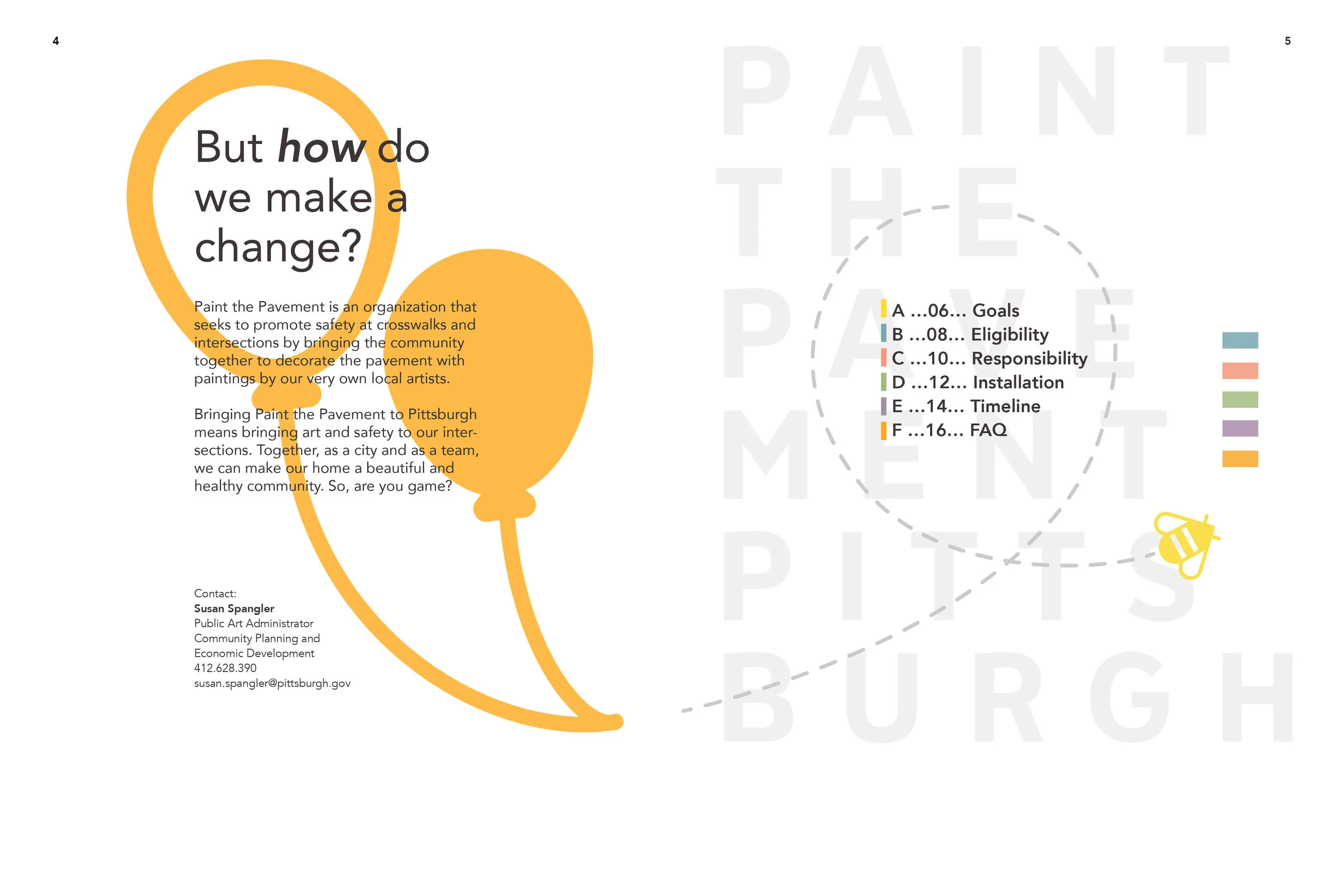
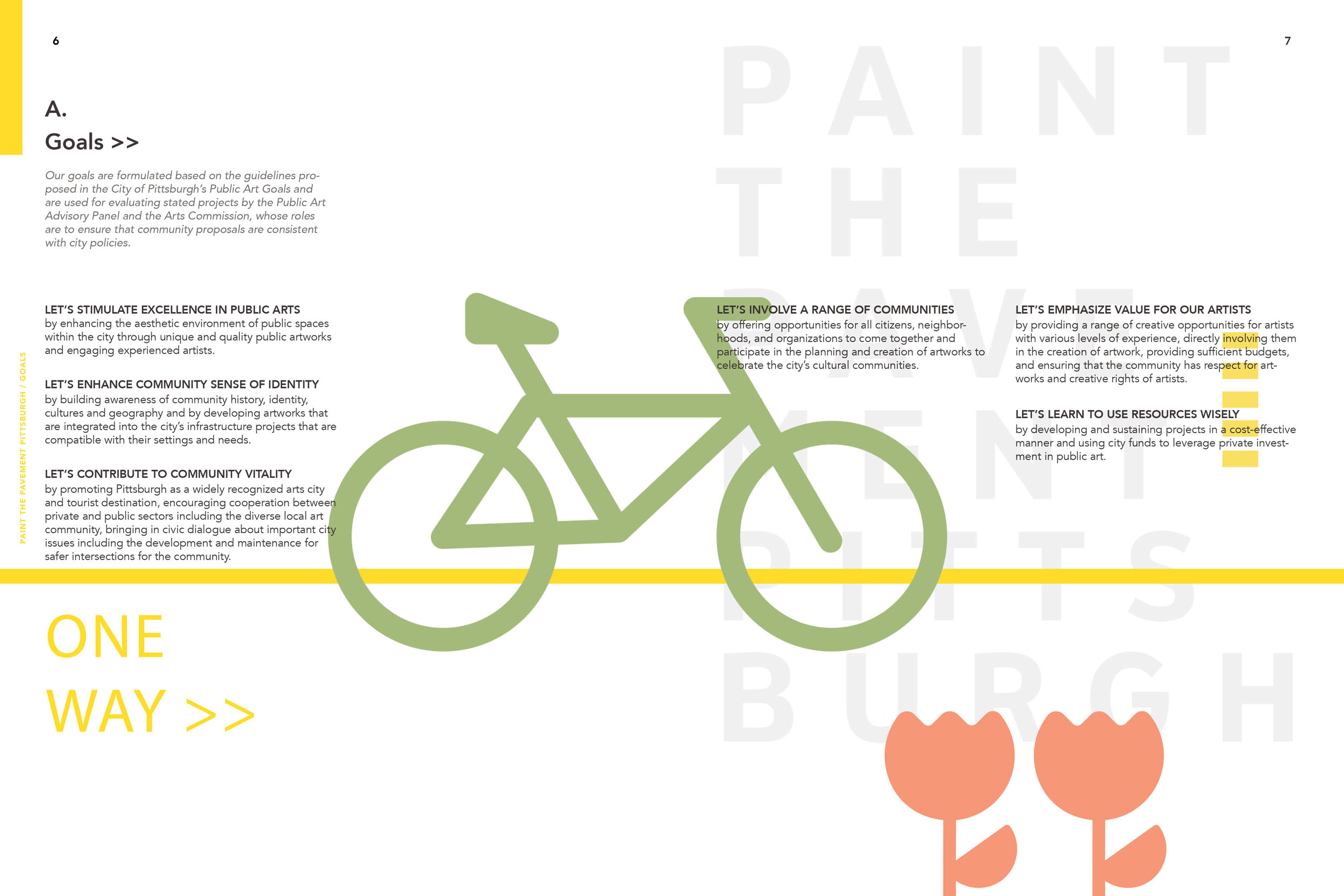
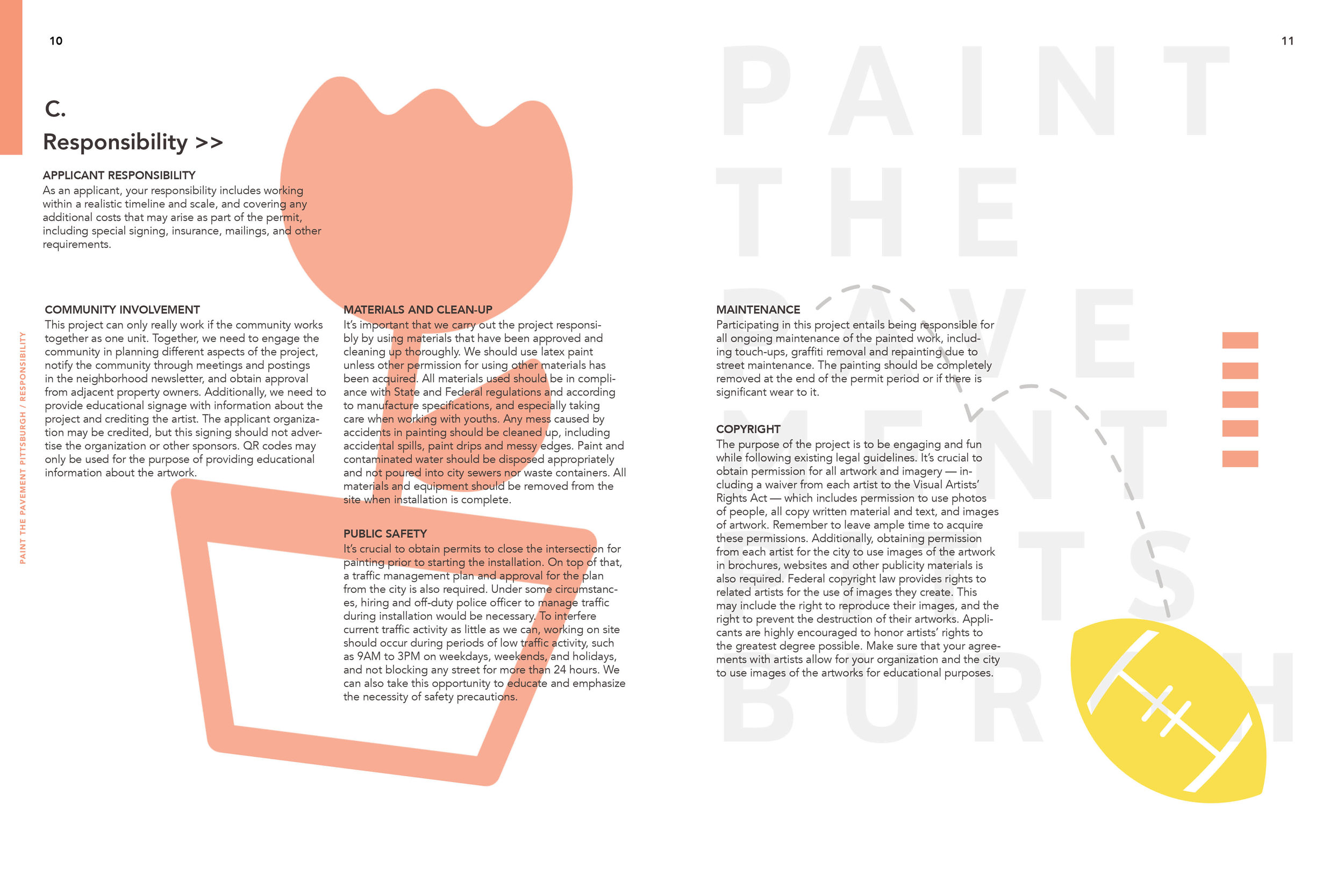
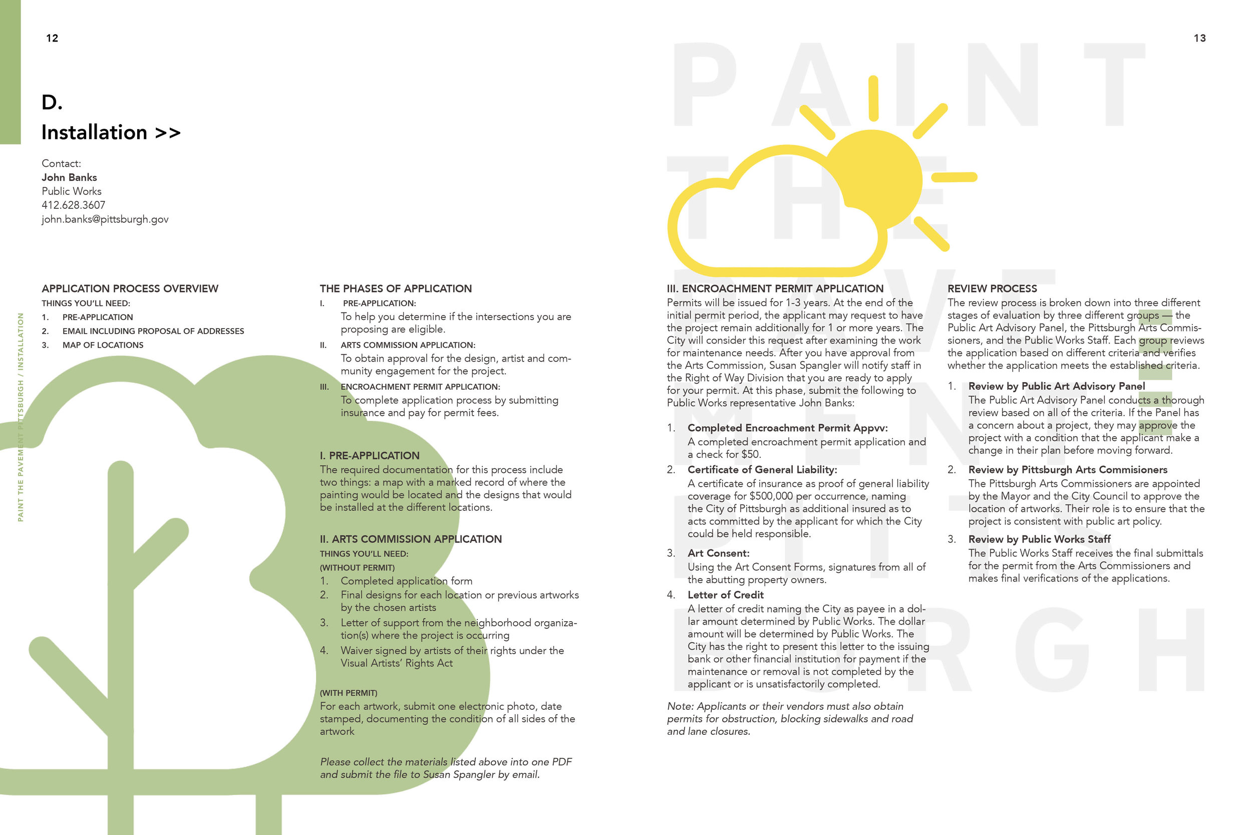
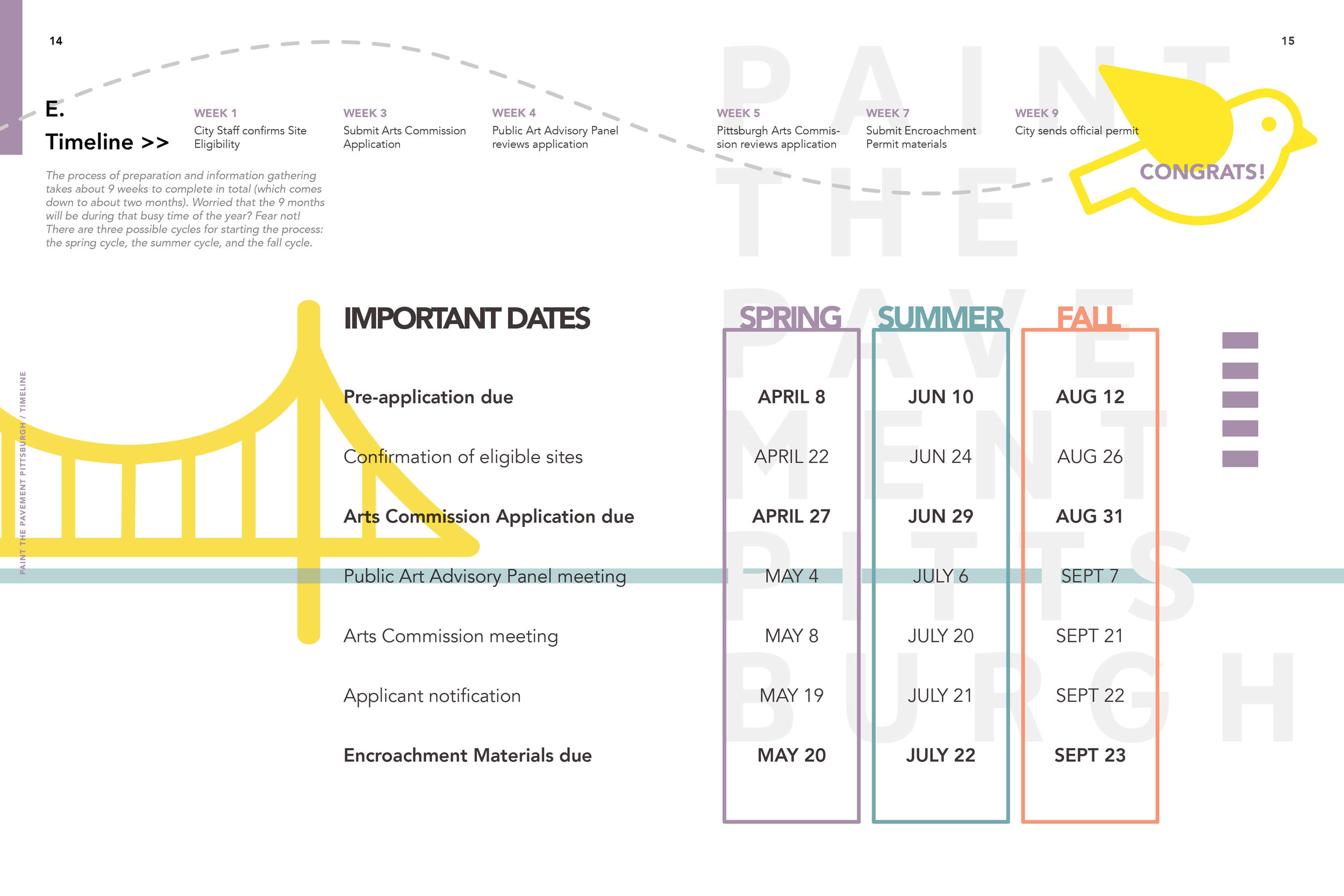
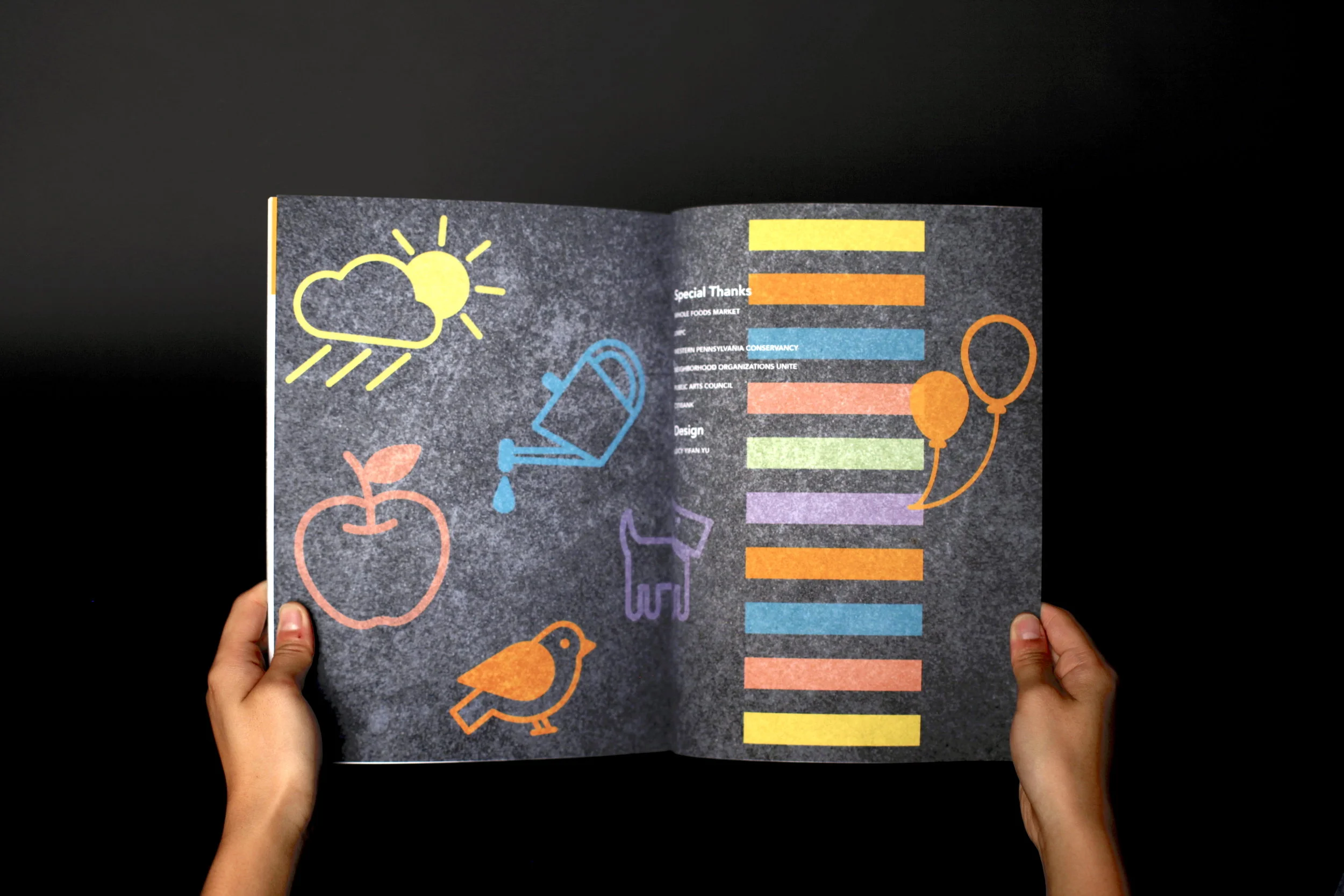
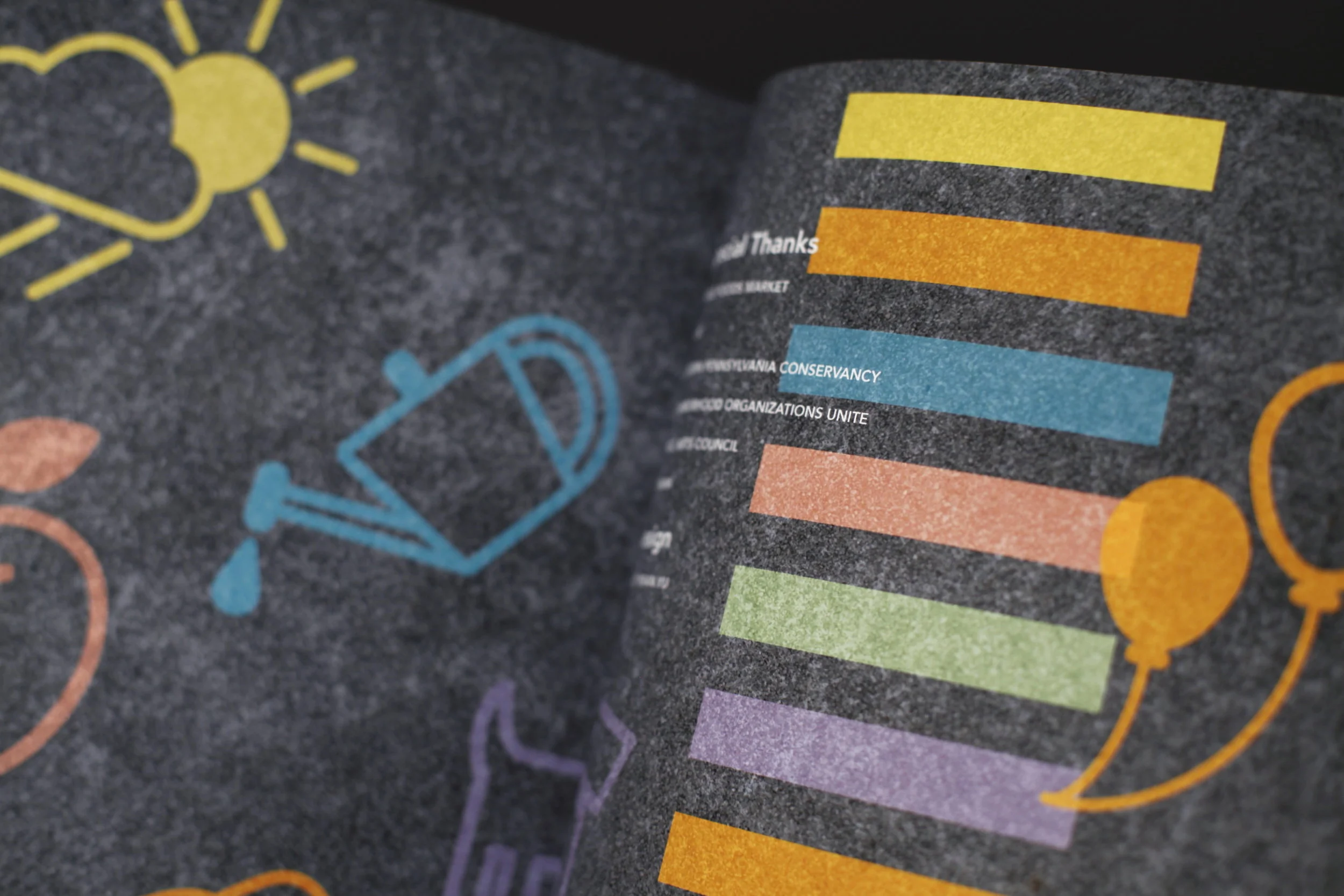
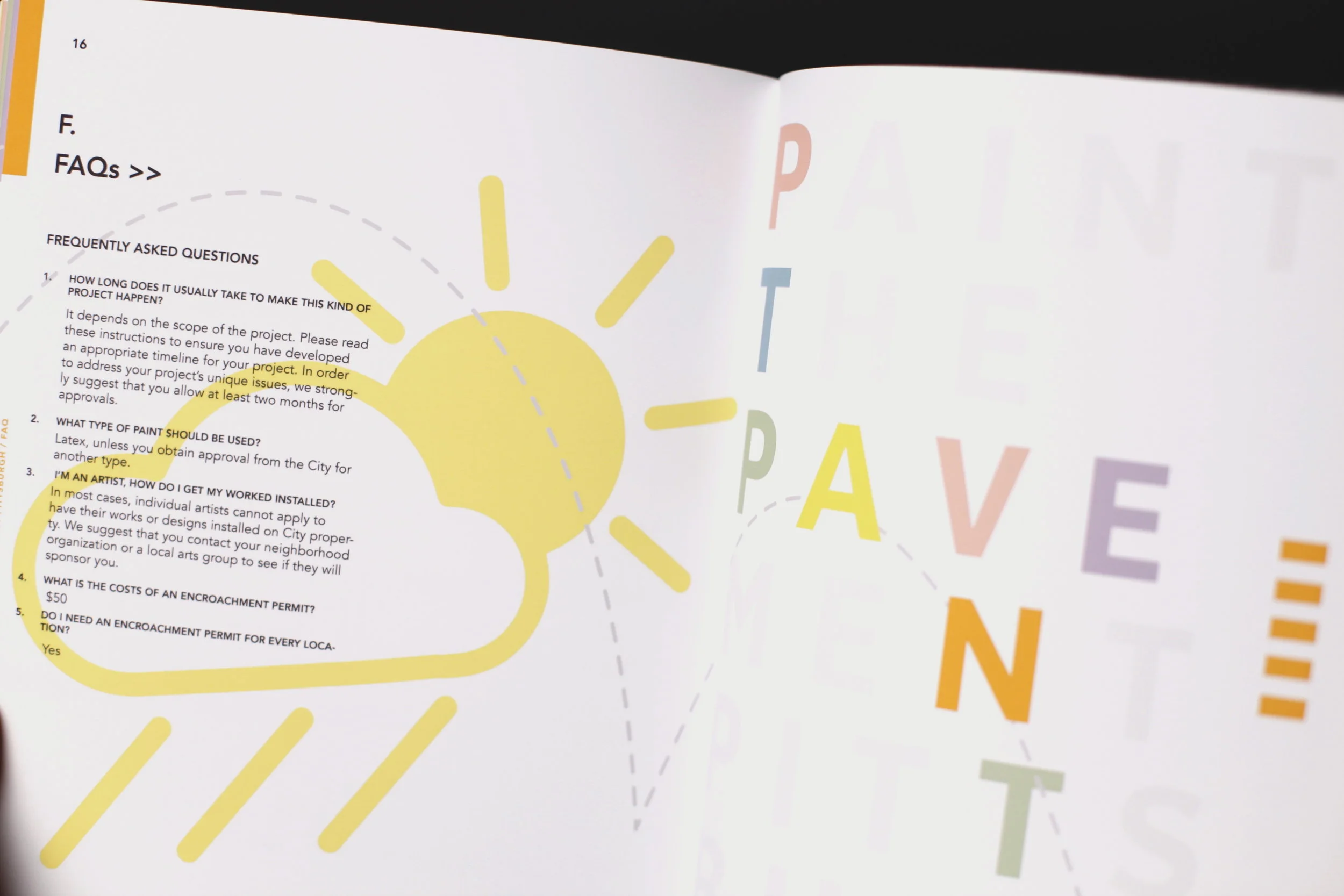
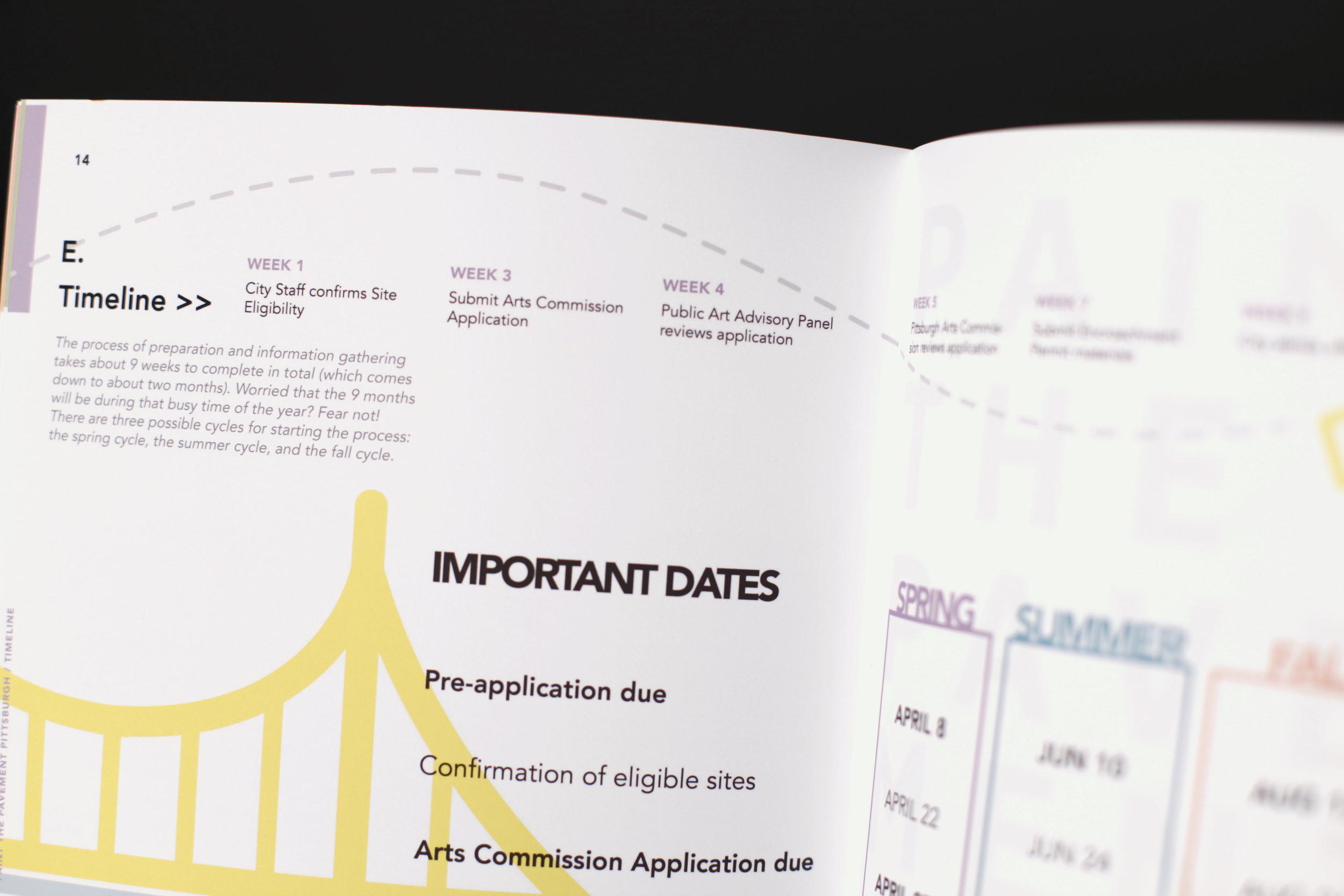
Paint the Pavement is an organization that seeks to promote traffic safety. As a communication designer, my goal was to create a simple streamlined application process for the community. The system includes all the details that are necessary for applying to the program, which are supplemented by colourful visuals and icons to convey a sense of "play" when completing the fun-filled application!
(click here to see the redesigned booklet in PDF format)
Visual Language
—
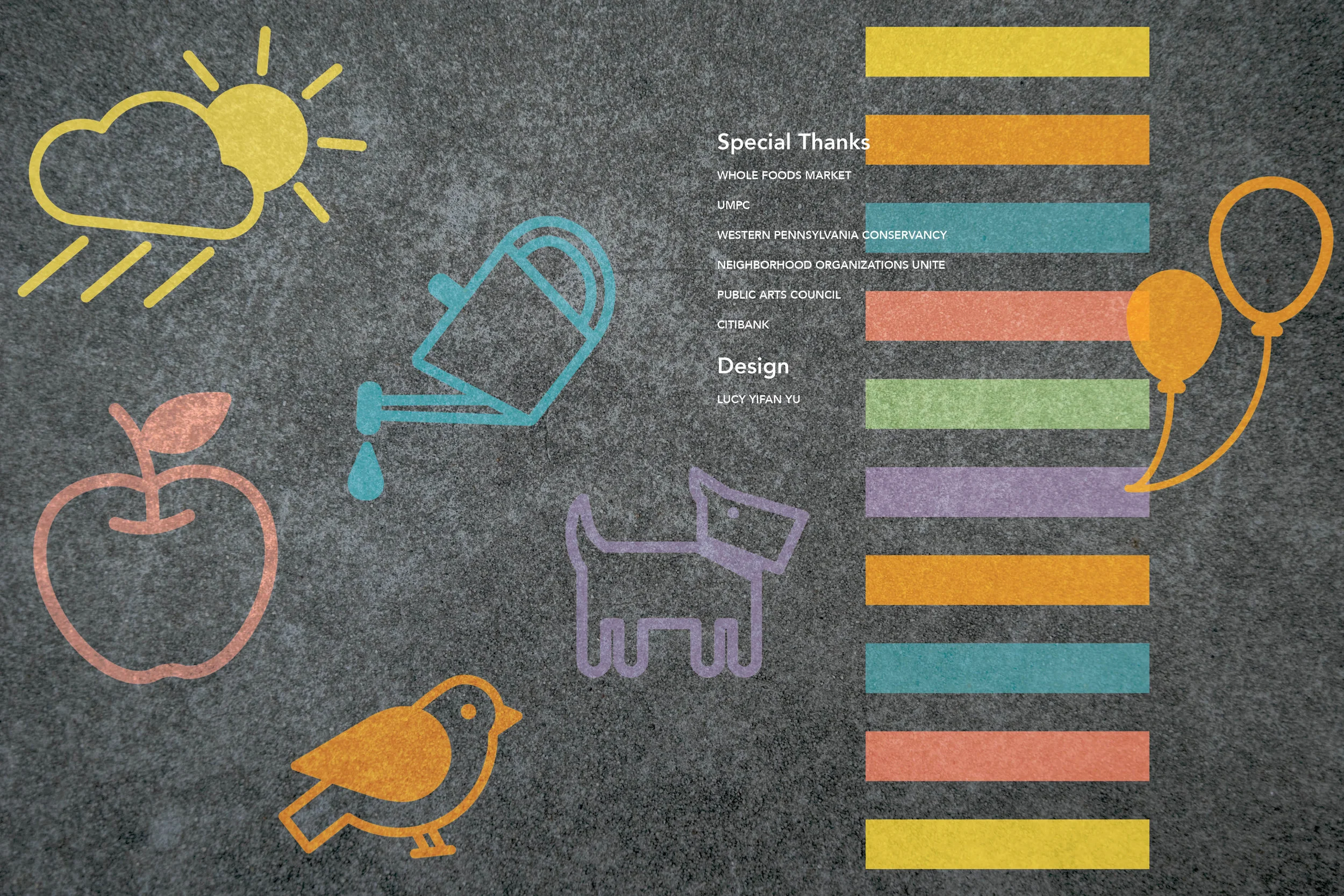
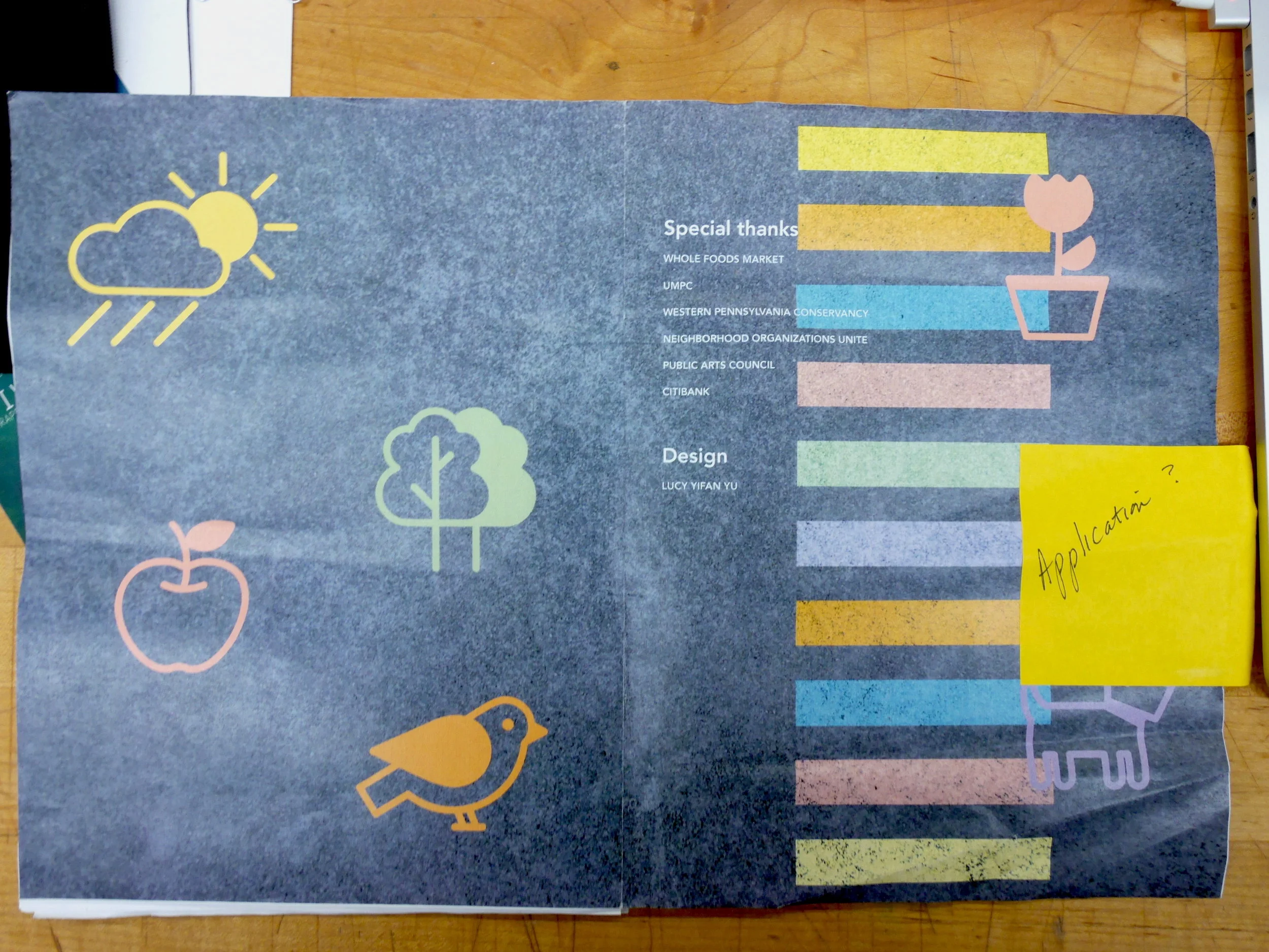
I created this set of icons for the branding of the Paint the Pavement application packet.
PROCESS OVERVIEW
—
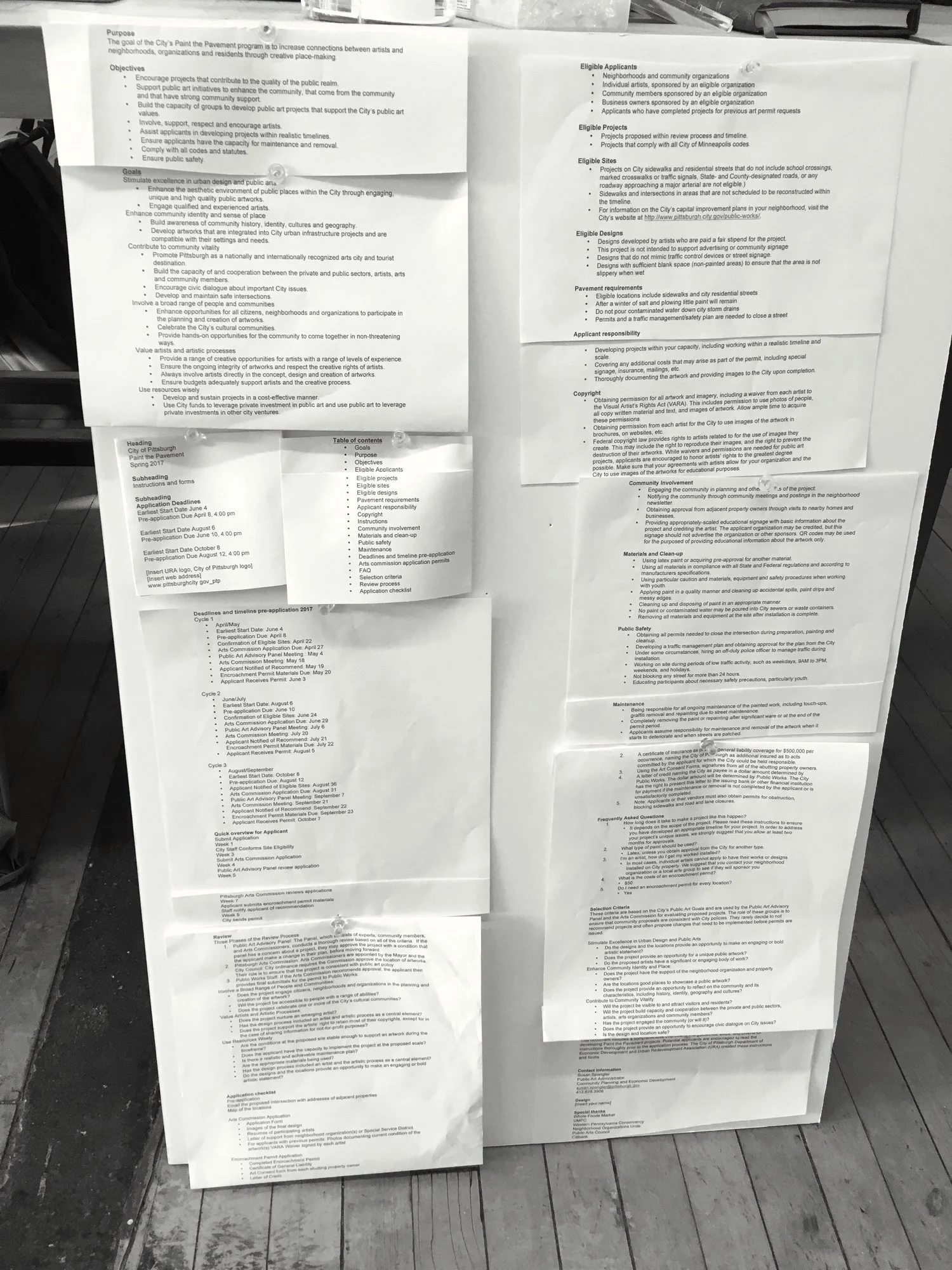
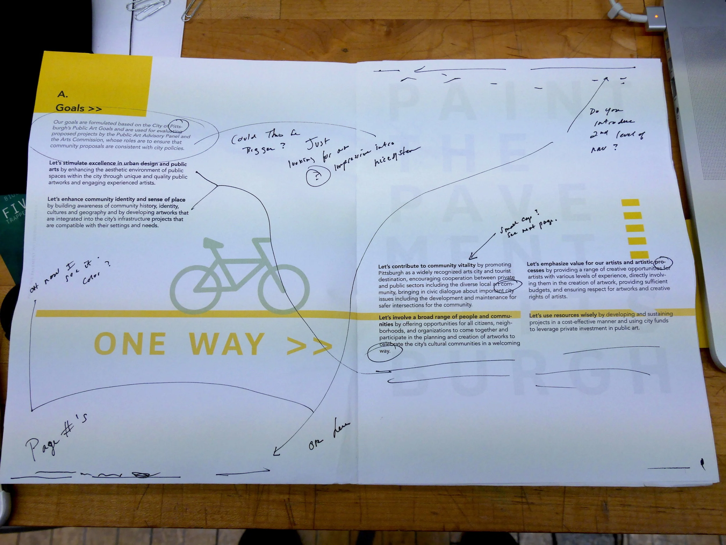
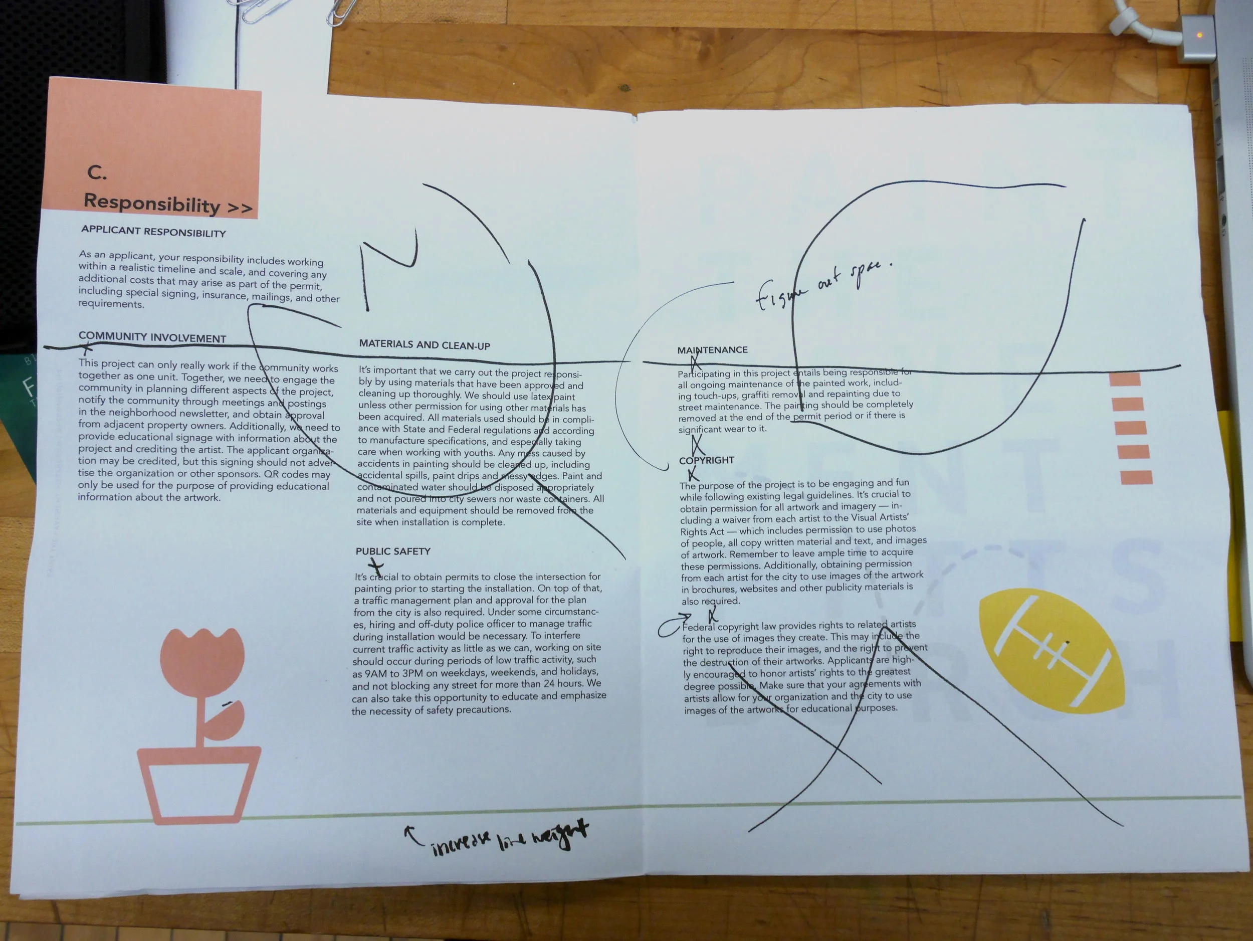
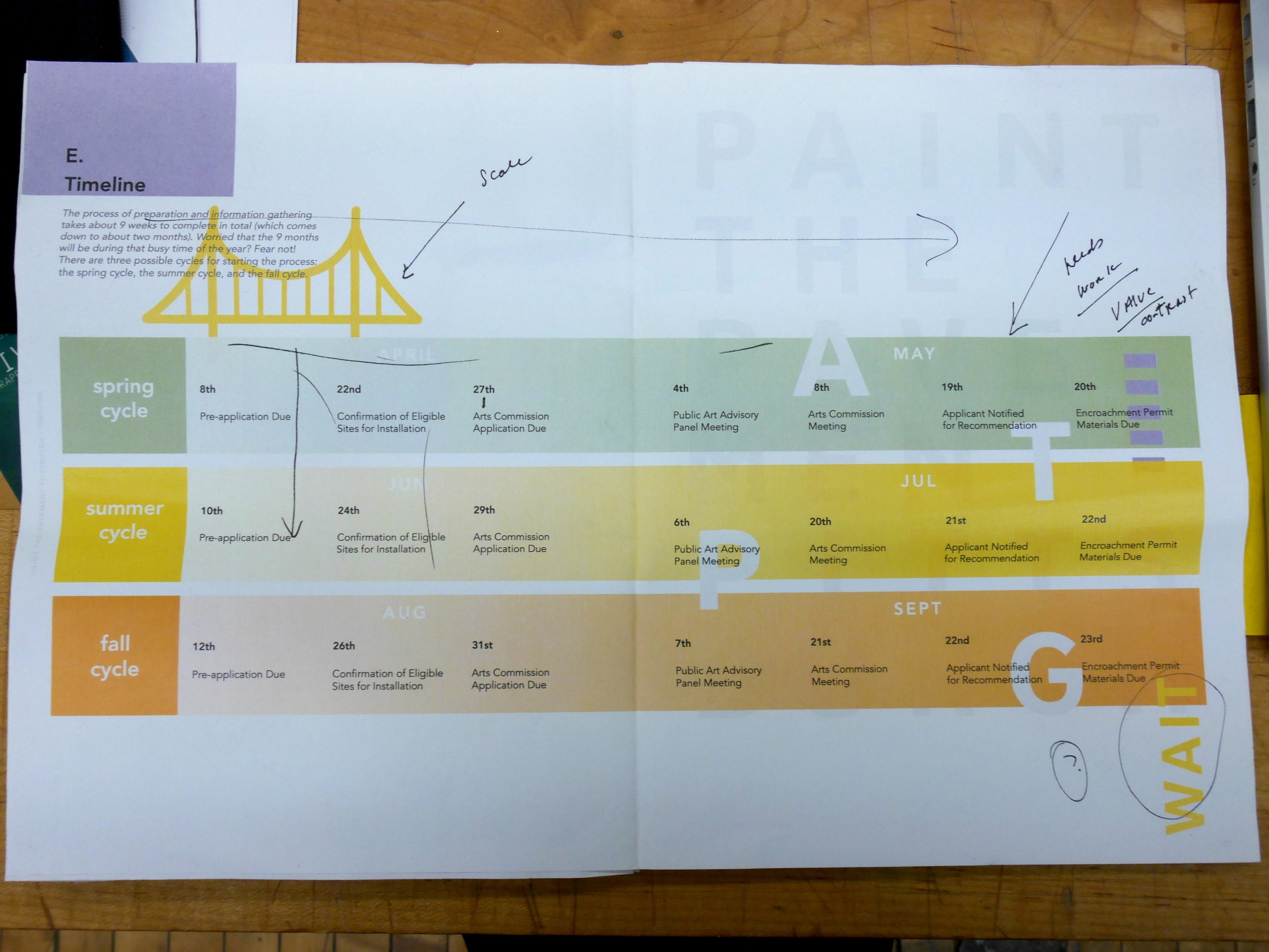
The original Paint the Pavement application existed in the form of a 20-page Word document — all in single-spaces, bullet points, and plain text. Not only was the document difficult to read, it also contained many errors. Through many iterations of editing, cutting, and rewriting, I modified the original document and restructured the way information was communicated so that the message is much more clear and concise.
Layout: Grid Studies
—
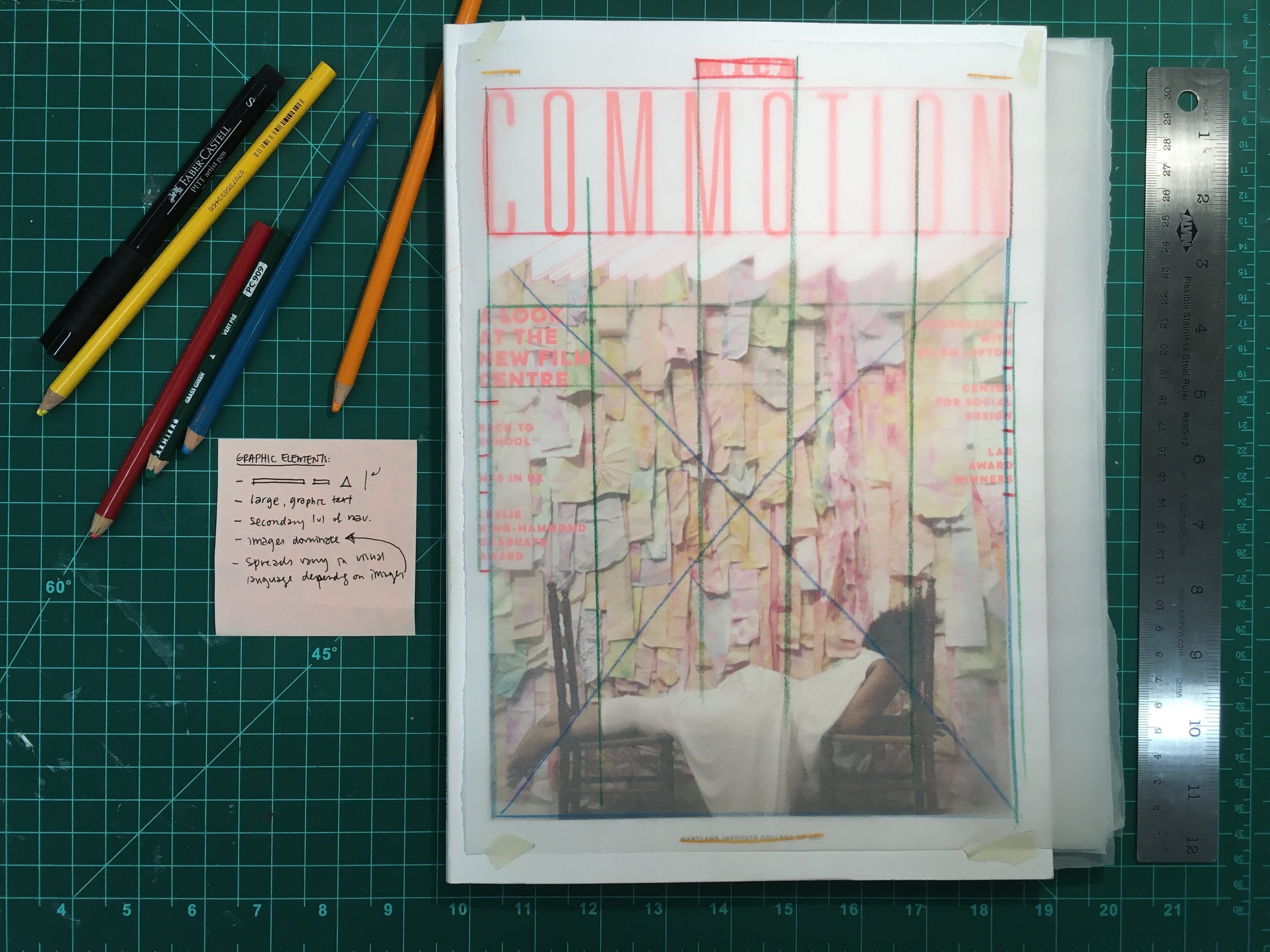
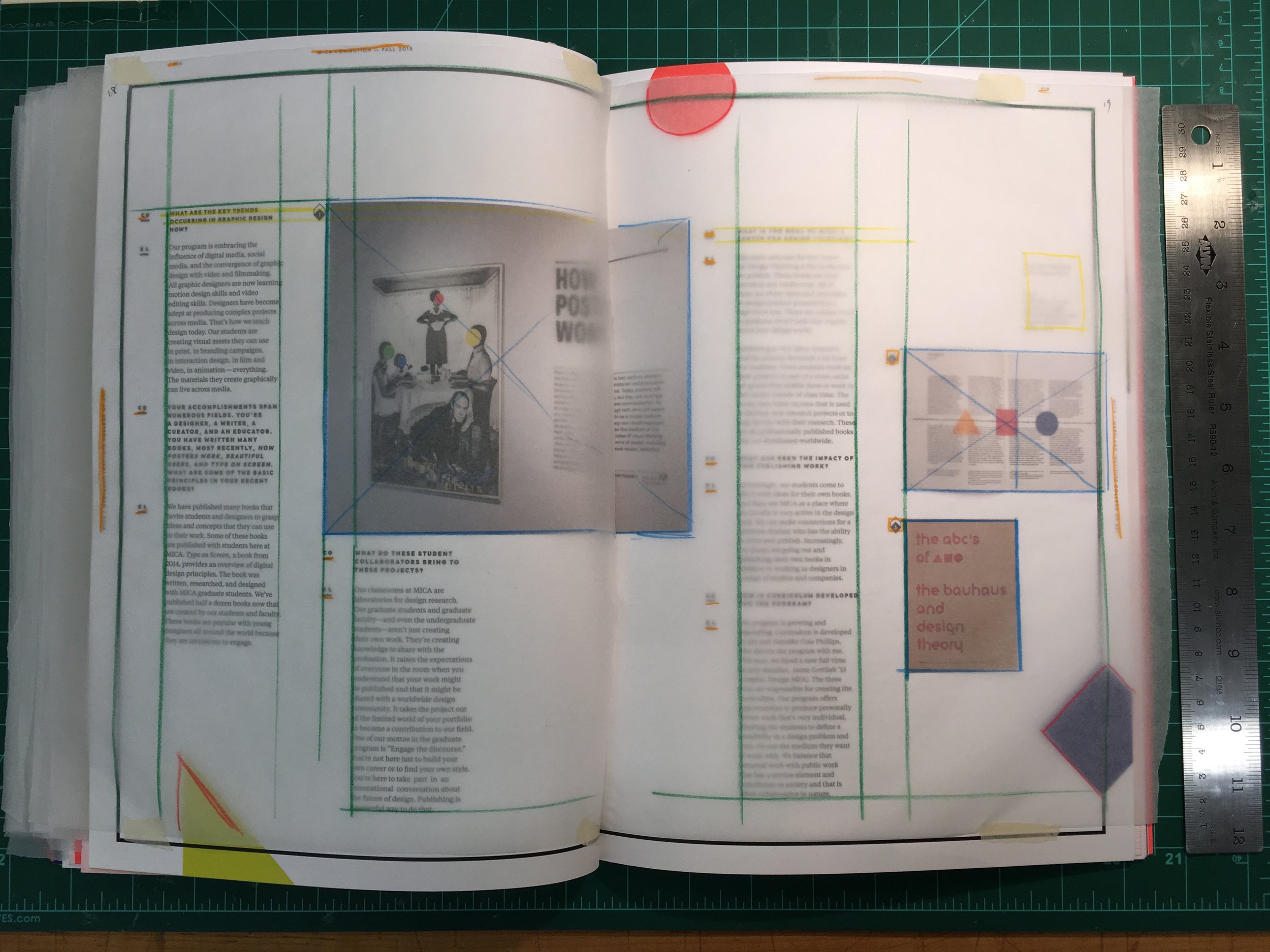
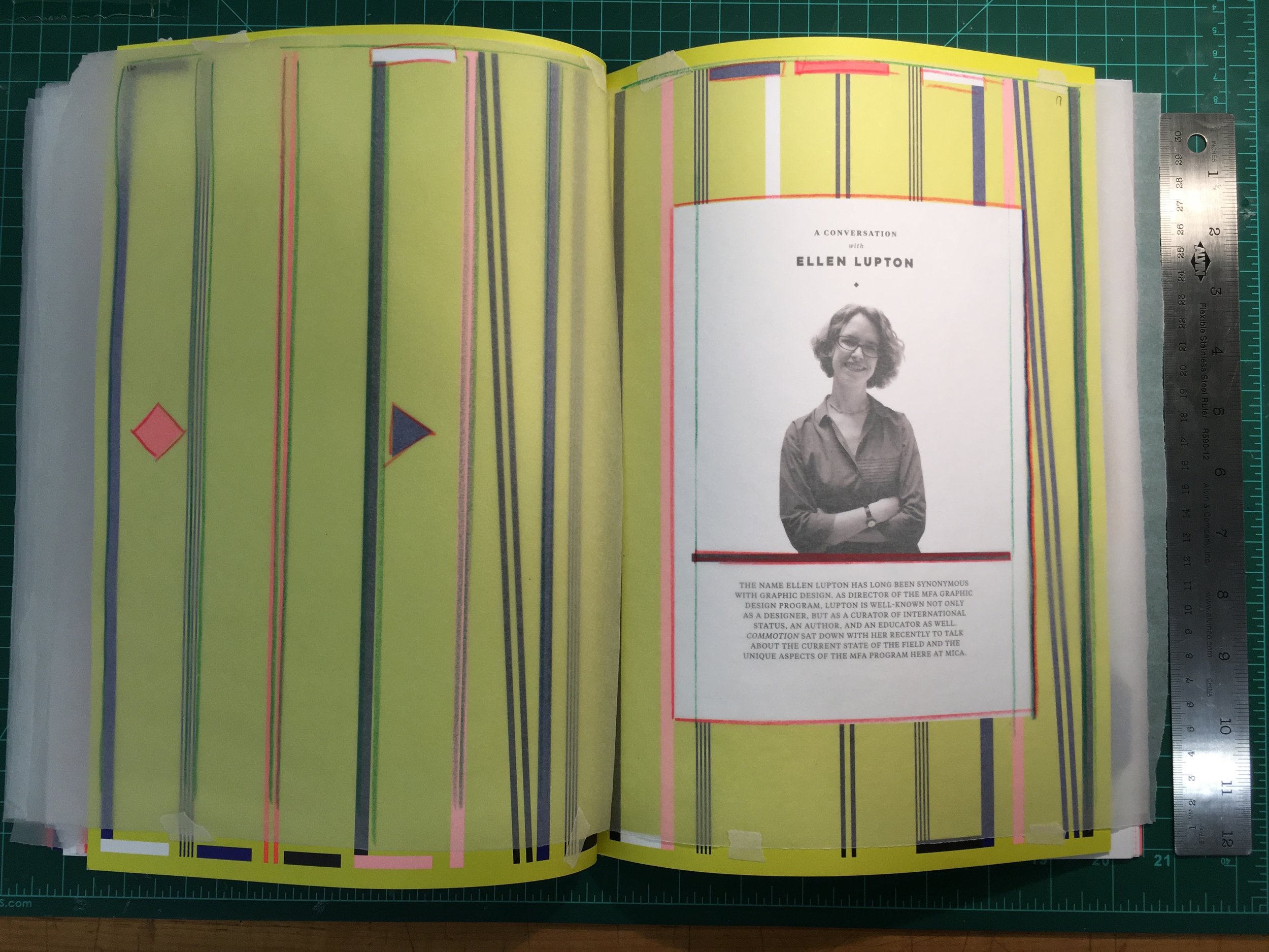
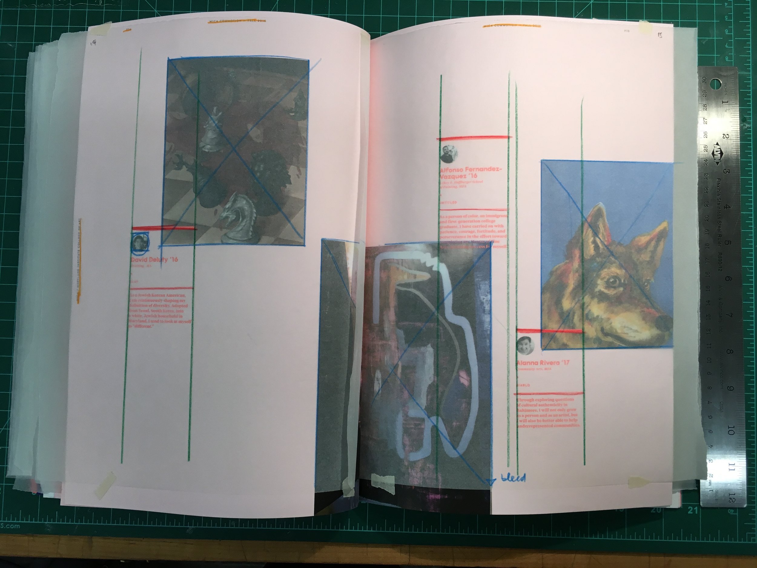
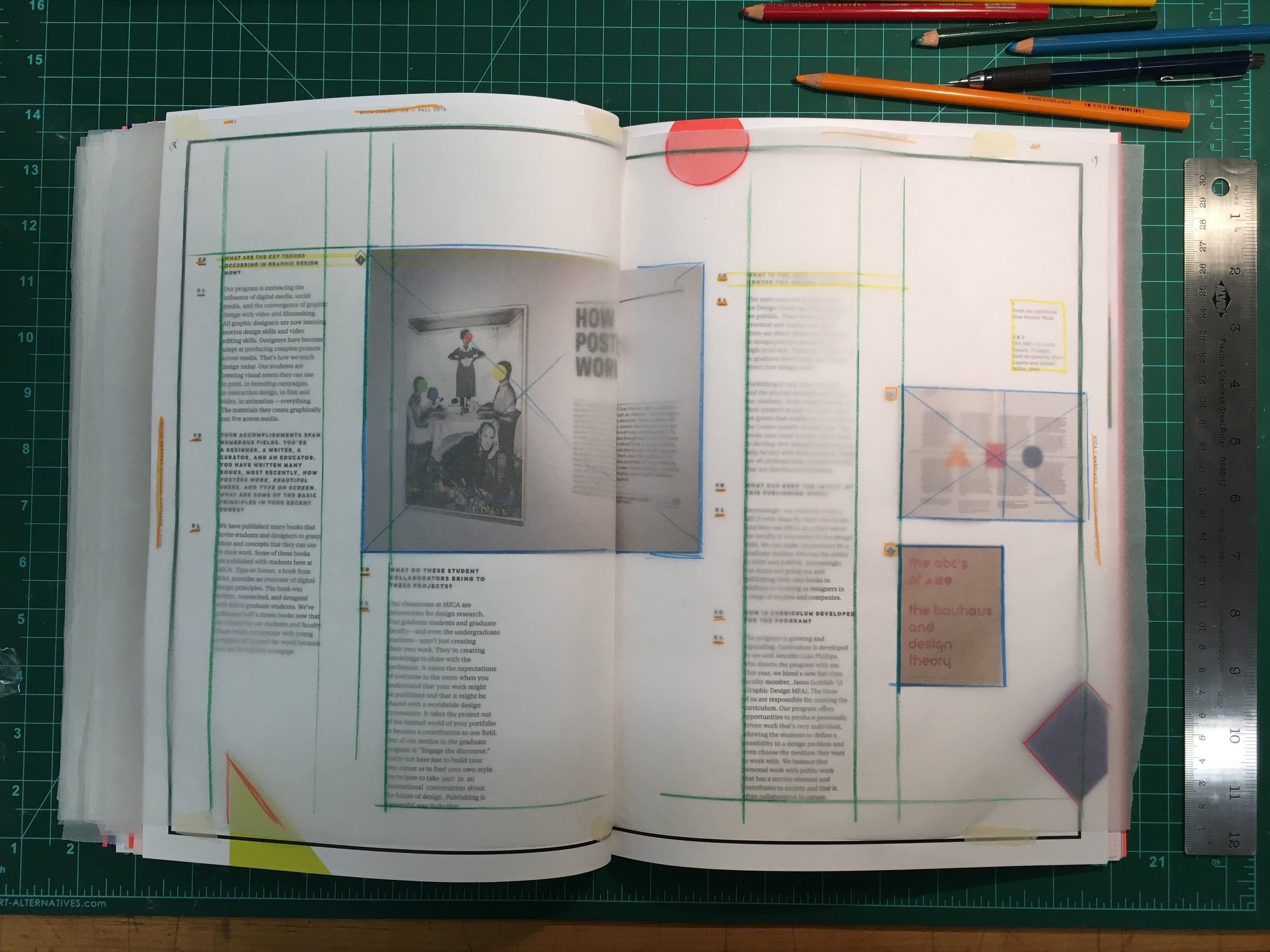
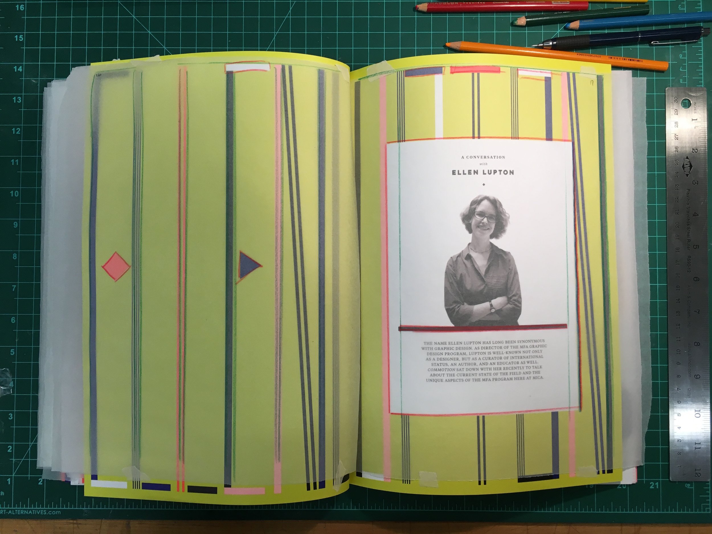
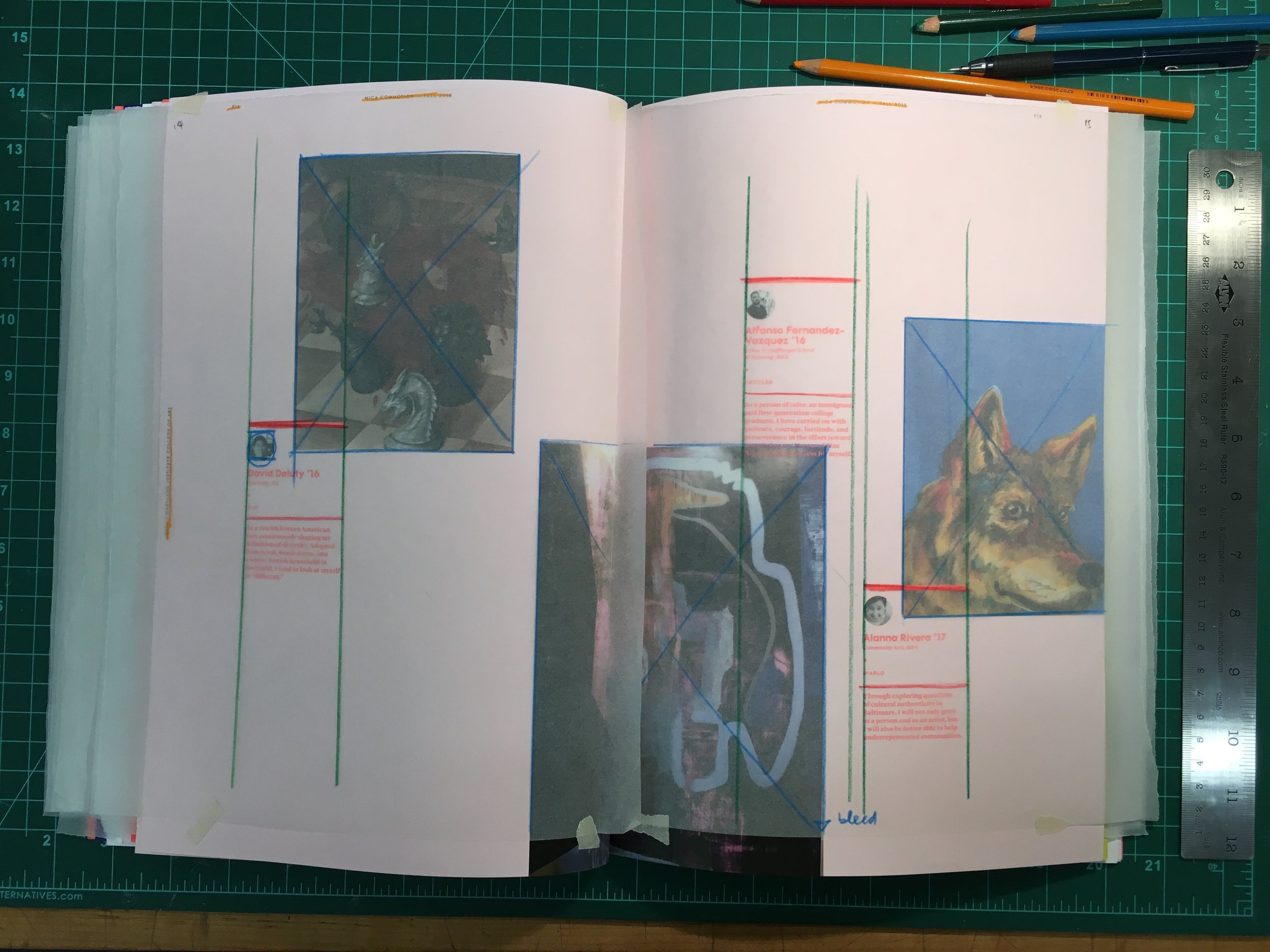
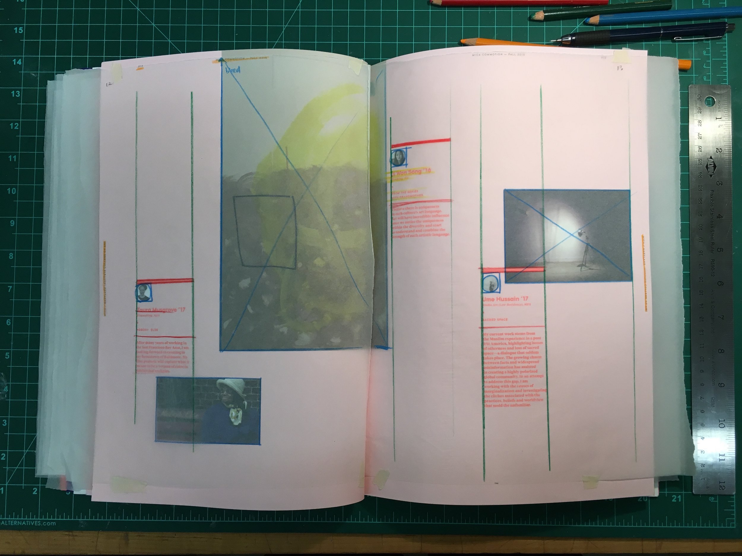
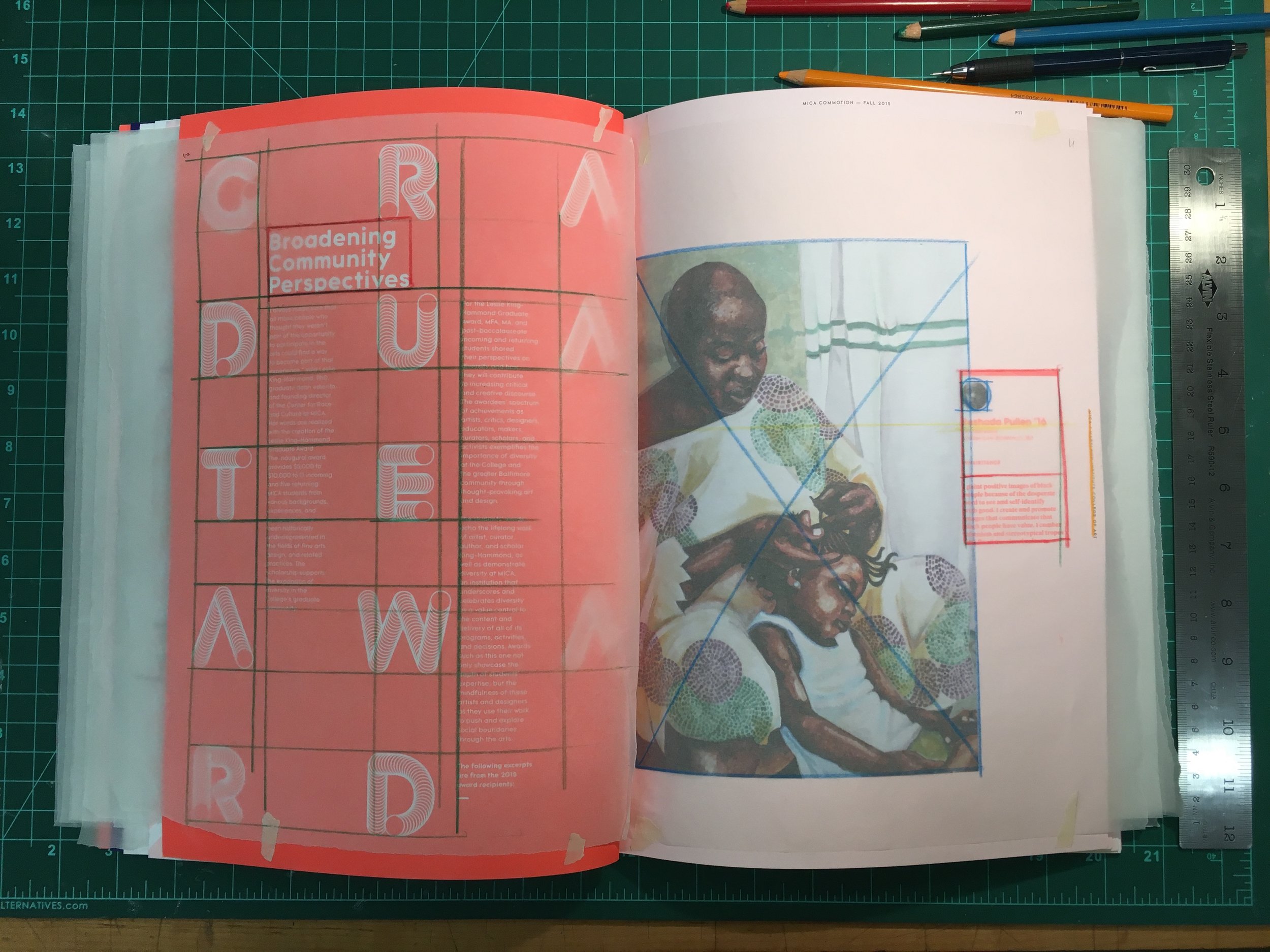
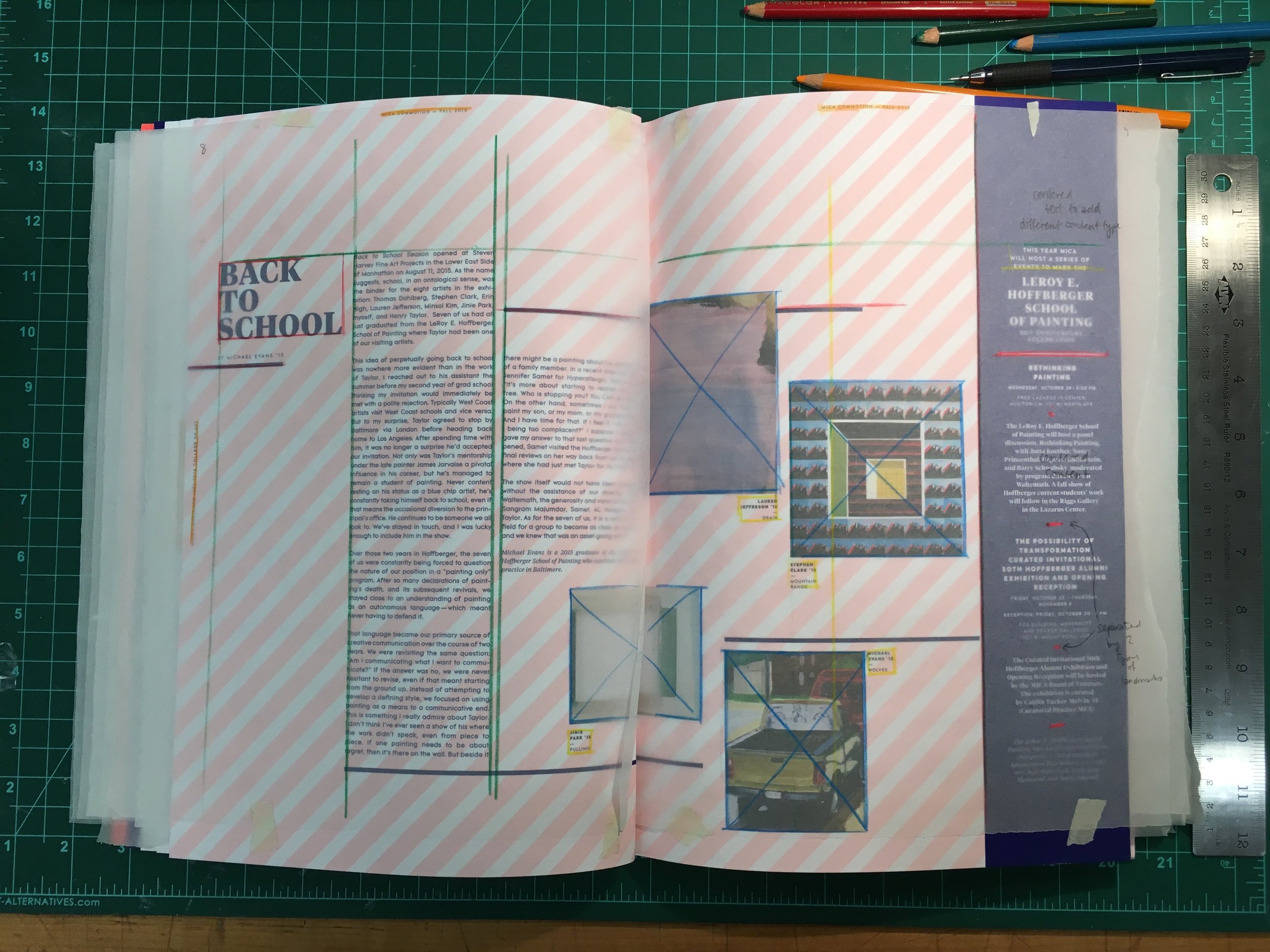
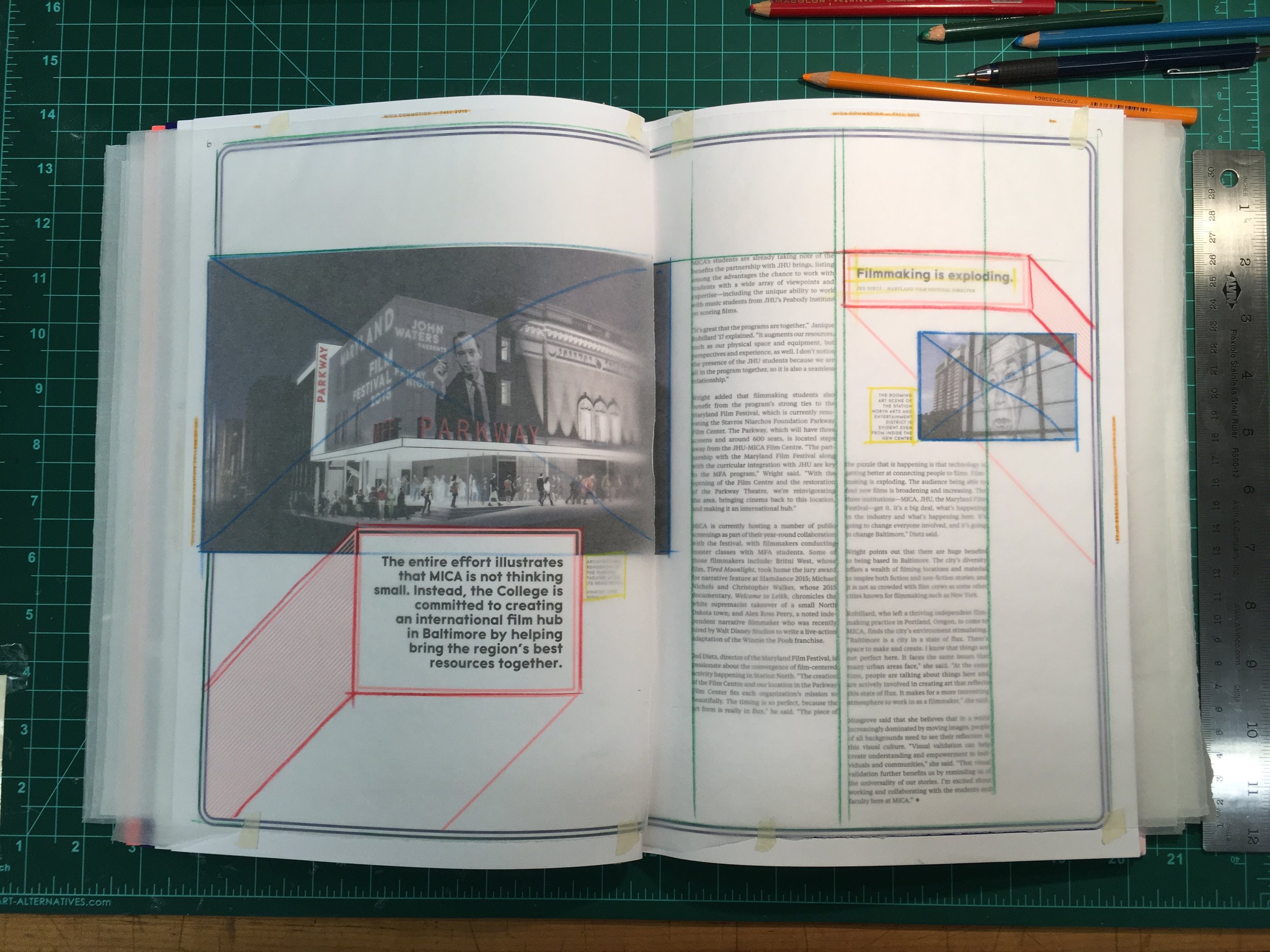
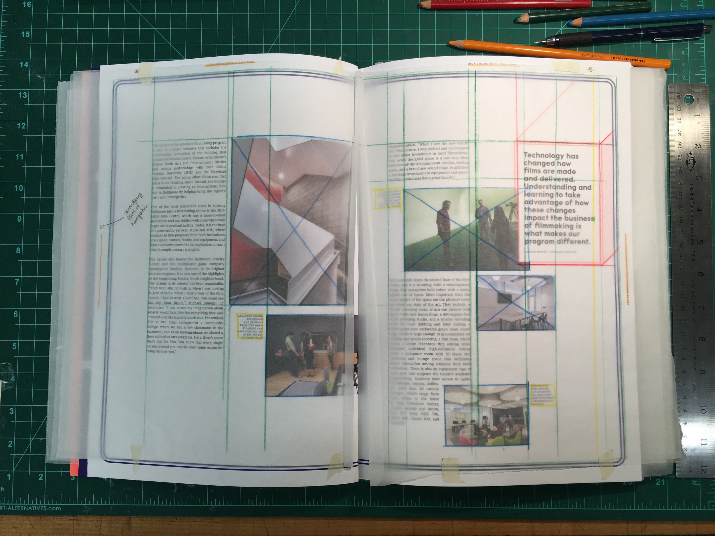
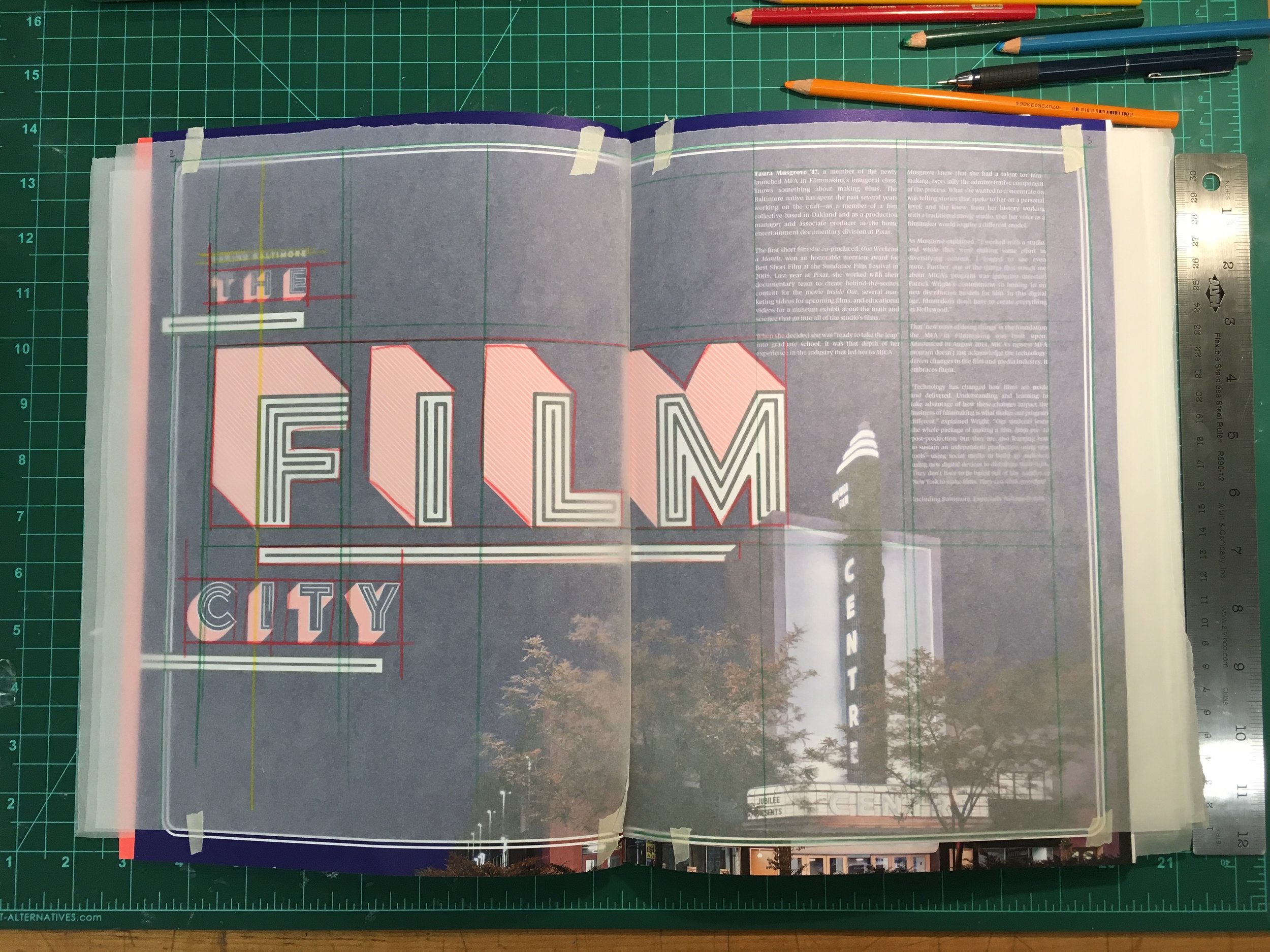
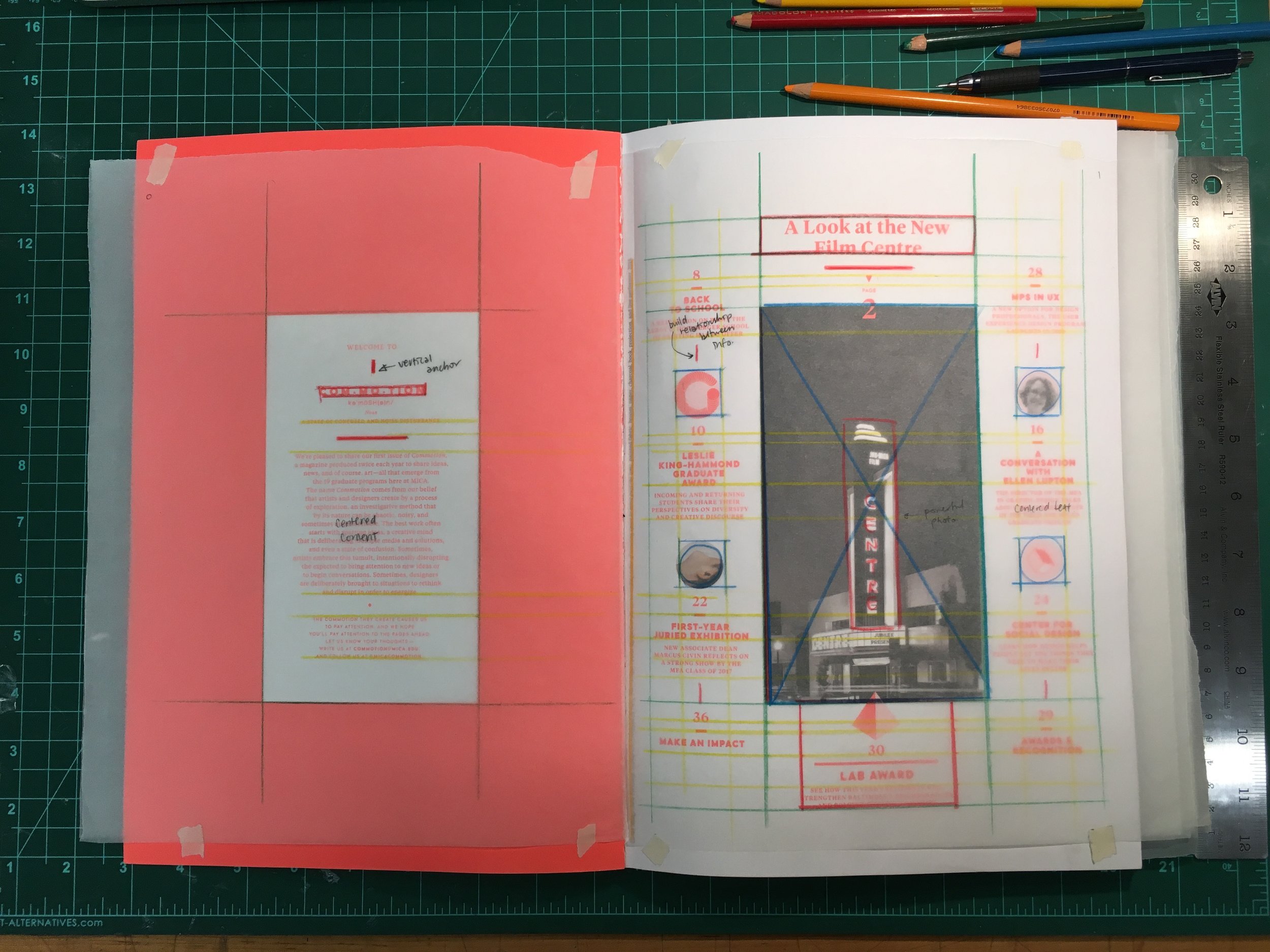
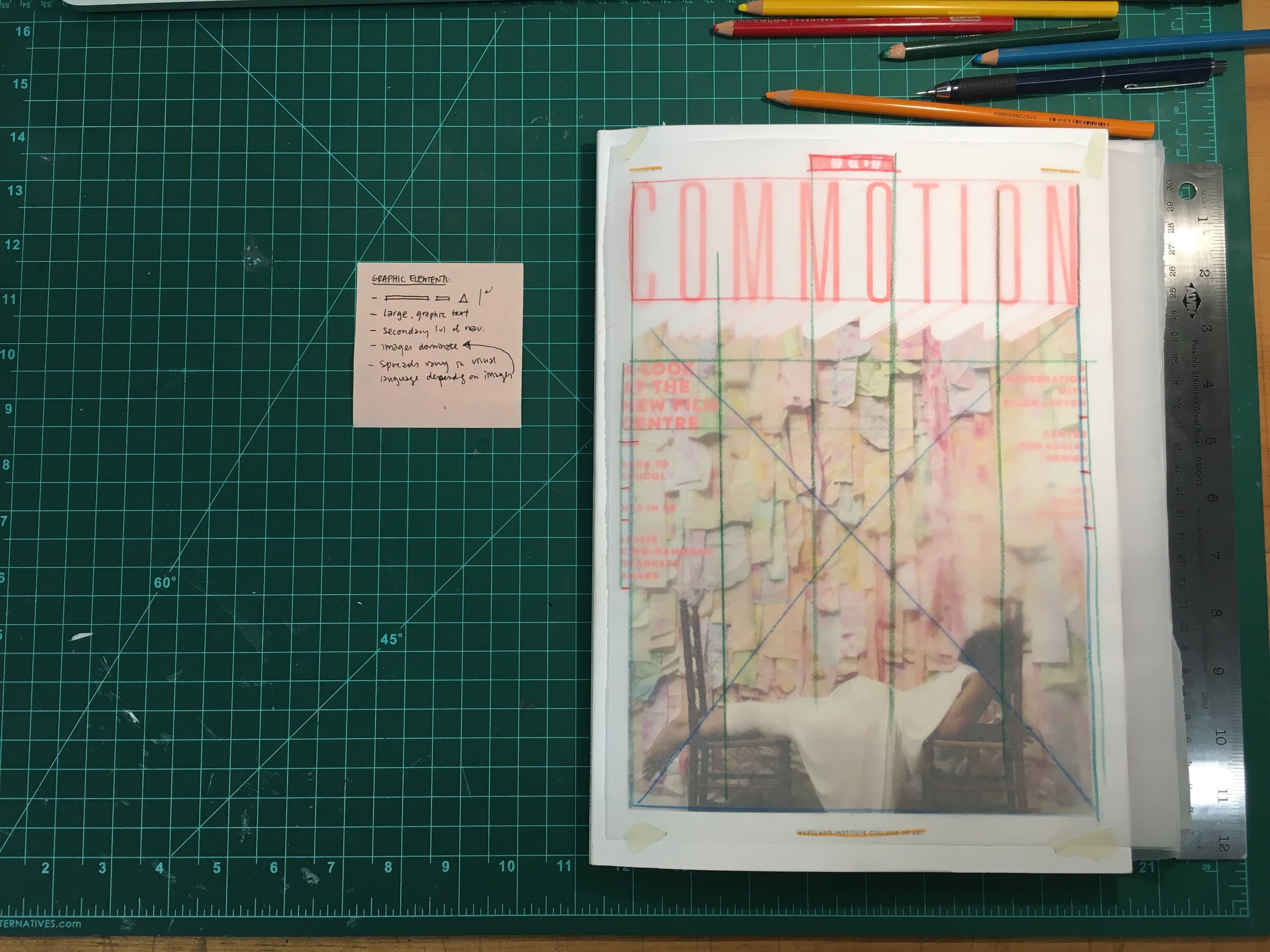
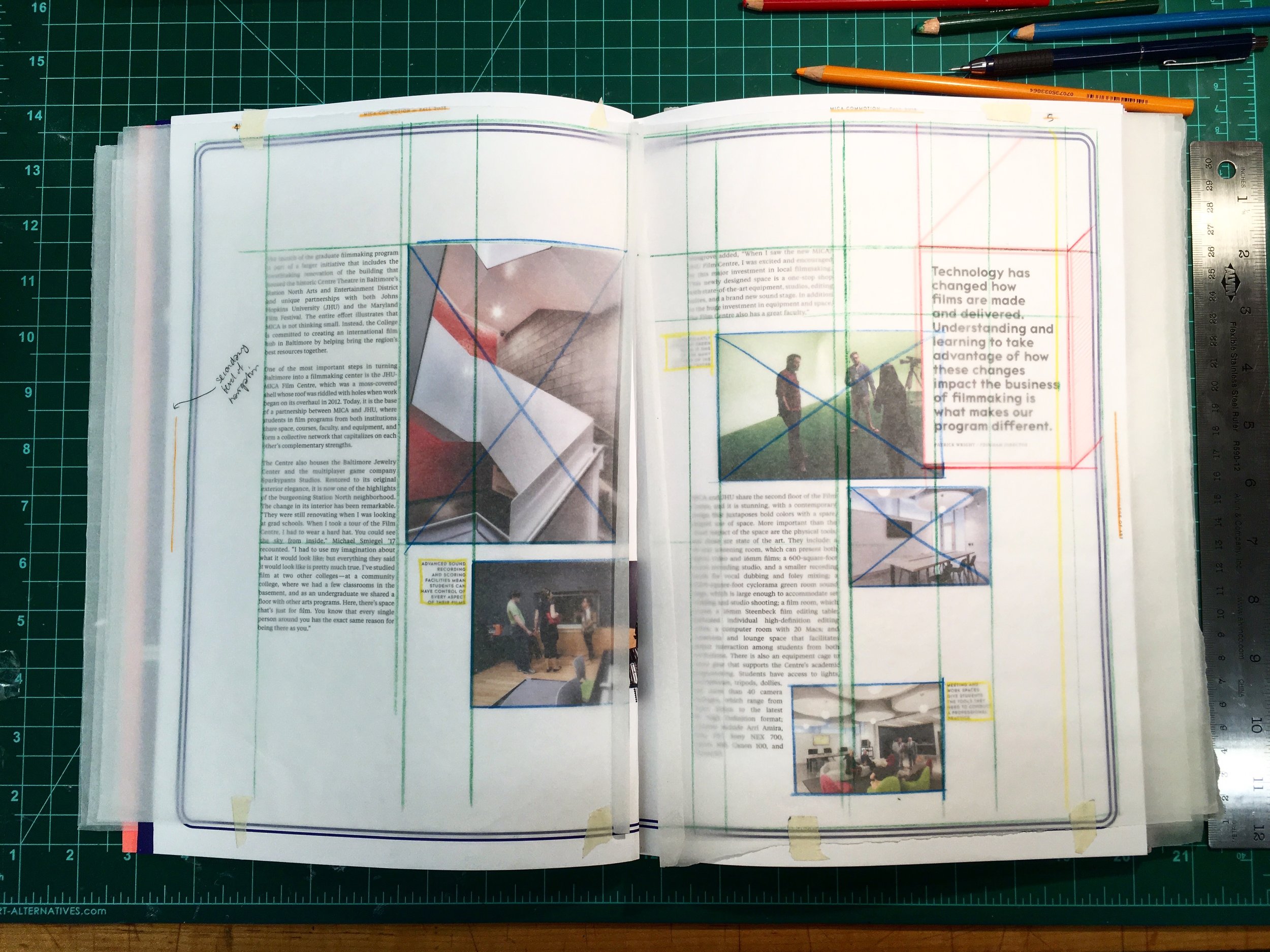
Before starting my own layout designs, I sought to draw inspiration from some of my favourite designs. I broke down their grid systems and analyzed how visuals were paired with text to create a clear, impactful message.
Visual Style: Development Process
—
I created a set of icons with the theme of a healthy community in mind. Based on this theme, I generated a word bank of nouns that reflected this ideology — nouns including education and gardening. Through exploring the different ways I could visualize these nouns, I realized that coming up with universally understood icons is actually quite challenging. Shown below is the evolution of my visualizations for education, as I discussed with peers about what represented this word in their mind:
Other icons slowly coming together:
